Design System
Eduka System
A design system is a collection of reusable components, guided by clear standards, that can be assembled together to build any number of applications, and the need for them go hand in hand with the need for scale, efficiency, and consistency in Design. In this project you will see some of the components that me and my team was built, but a design system is much more than just a component library.

Brand Library 🚥
This brand style was developed by the brand & comms team. I and my team took all our brand assets and developed it into a Figma library, so that it was easy for designers across the organization to have the latest brand resources.
p.s. Figma is AMAZING.

Styleguide 🎨
-
Primary Colors

-
Secondary Colors

-
Error & Success Colors

-
Greyscale

Typography 🔤

Buttons ⌨️

Iconography ❇️

.jpg)
Form Fields 📝


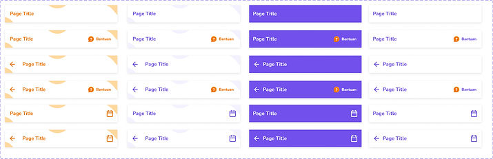
Other Components 🎁


Illustration Mascot 🧡


The Result 🎀
-
Documentation
A shared space where you say when and how to use the design system.
-
Visual Language
Guide to what the brand feels like. At Eduka System, when we communicate with people, we position ourselves as a friend who are willing to help them and make them succeed.
-
Pattern Library
Also called "component library" includes what you see above.
-
Brand Guidelines
Includes principles, tone and voice, writing style, and more.
-
CSS Framework
Front-end code that developers use to build a product.